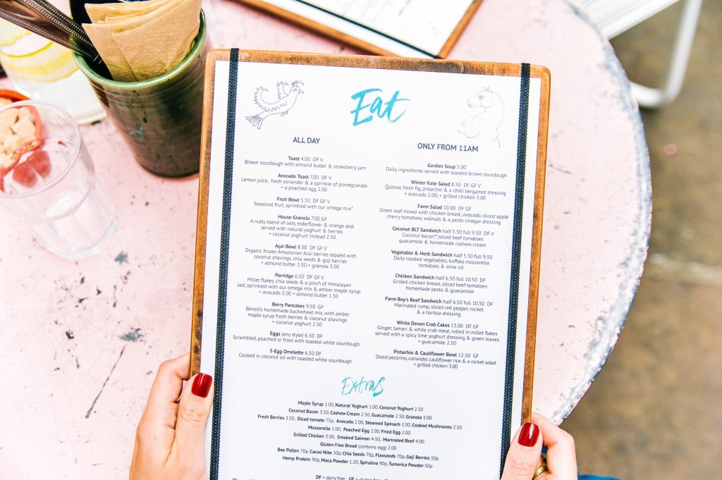
Are you often left guessing why some menu items fly out the door while others barely get a second glance, especially when they are seemingly similar offerings? Perhaps you spent hours designing your menu offerings but your favourite creations are just not selling like you thought they would? Or maybe your customers just keep choosing the cheapest items on the menu?
It may be to do with your menu design of all things! And we don’t mean the food offerings, but the layout, language, colour and pricing of your actual physical menu can often affect customers decisions when ordering (without them even knowing!).
If you’re keen to learn how you can use these factors to tempt your customers to spend that little bit more at your venue, you need to consider these four influences.
Pricing, symbols and numbers
It’s not surprising that your customers are always more likely to order cheaper dishes. But to combat this, venues often use ‘anchor’ pricing. This is where you put a very expensive item next to the more reasonably priced items to make them seem much better value by comparison.
You can also look at the ‘right next door’ tactic which means putting the items with the highest profit margin for you next to the ‘anchor’ item. That way, the customer is choosing the cheaper option but also choosing the one that makes your restaurant the most profit. A win-win!
Other things to consider are leaving the dollar signs off prices (this makes a bigger difference than you’d think!) and changing your numbers so they aren’t round figures. For example, buying an entrée for $14.90 feels better than $15.
The size of your menu
Sometimes bigger is not necessarily better. Although you should always be trying to cater to your full customer base as much as possible, a huge menu with an overwhelming number of choices often ends up being more confusing than tempting.
The more options we have, the more anxiety we feel when choosing. So what’s the perfect number to prevent panic at ordering? Seven. Apparently, you should have seven options per category to stop customers from feeling overwhelmed, while also preventing them from ordering ‘what they always get’.
Layout
It is important to keep your menu design uncluttered and clear. Too many graphics and images look messy and takes the attention away from your menu items.
You may also want to consider where you put your prices. Most restaurants put their prices neatly down the side of the menu but that also makes it easier for your customers to compare prices directly. Instead, list the price discretely after the meal description in the same size font. When customers must read through the descriptions to get to the price, they are more likely to be tempted by the food than put off by the price.
While we’re on layout, according to studies, people look at the top right of the menu first and the bottom left of the menu last. With this in mind, you should include your most expensive stuff (usually the anchor item) in the top right and the less expensive stuff at the bottom and the left.
Descriptions
More and more these days diners want to know they are making a relatively positive impact with their purchasing (and dining) decisions. So, if you source your food locally be sure to include this information on your menu. On top of this, consider how you are listing your ingredients, for example ‘bacon’ won’t sell as well as ‘free range bacon from Bob’s Organic Farm based in the foothills of the Victorian High Country.’
Another simple way to add temptation is to name your menu items authentically. If your pasta is based off your Nonna’s recipe call it ‘Nonna’s homemade fettucine’ which will evoke a sense of nostalgia and authenticity.
How’s your menu looking? Is it time for a menu redesign? Make sure you keep these four factors in mind, and we guarantee your table-value will increase.
